K–12 EdTechB2B/Enterprise SaaS
Re-engaging Disgruntled Users: Dashboard Redesign2
Turning a dashboard teachers dreaded into one that felt like a relief.
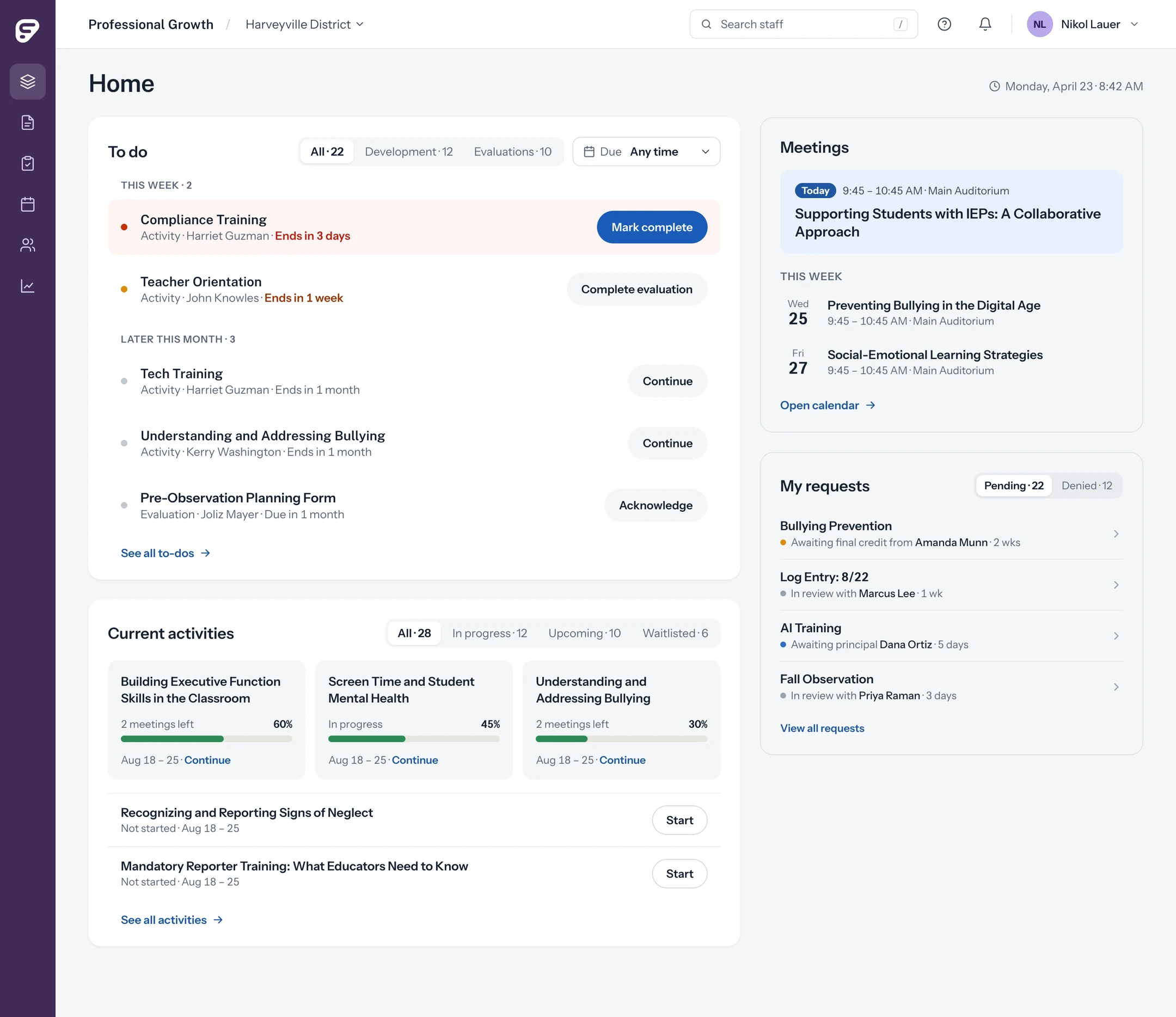
The 30-second version
Problem
Lowest NPS of all seven Frontline products
Teachers dreaded logging PD. In one case it cost someone a raise.
What I did
Proposed the fix, then proved where it belonged
Triangulated ODI, NPS and analytics. Audited the IA. Validated a new direction.
Outcome
Unanimous positive response from 6 participants
New components approved as reusable React components across Frontline.
Drag to compare the legacy dashboard with the redesign.
- Role
- Senior Product Designer
- Team
- 1 designer (me), 3 PMs, 1 eng lead, 2 dev teams
- Timeline
- 10 months, 2024 to 2025
- Scope
- Research, strategy, end-to-end design, design system
Go deeper
01 The problem Leaving money on the table
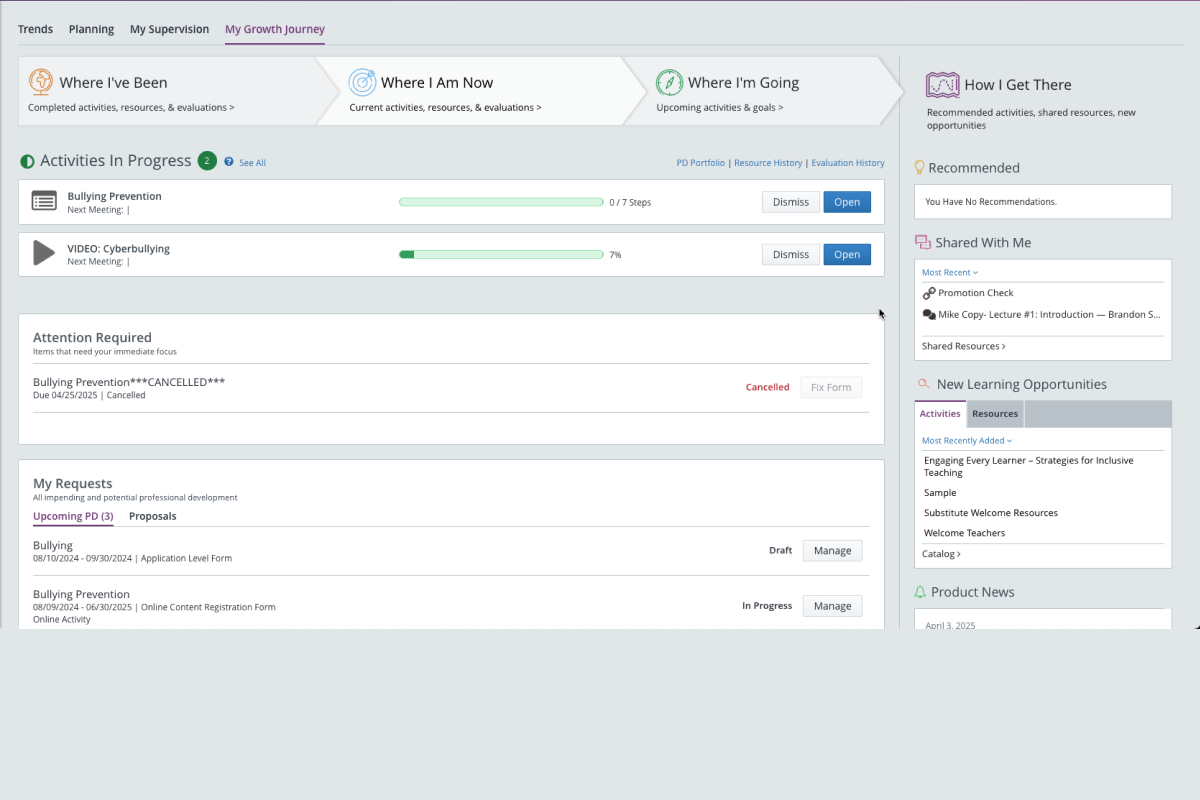
My Growth Journey was a legacy redesign that was not making users happier. It was supposed to help staff “focus on their growth and not on keeping track of it.” After MGJ was released, Professional Growth had the lowest NPS score of all of Frontline’s products. I inherited the challenge of redesigning the redesign.
Our PLM product was so hard to use that teachers dreaded logging in to complete their professional development. In one case, it literally cost someone a raise.
Users just wanted to get in, see what needed attention, and get out. But the existing experience scattered critical actions, progress indicators, and approvals across a layout that didn’t match their mental model. They had no idea where to look to get the information they cared about.
02 Opportunity The landing experience was the highest-leverage fix
I proposed this initiative during a cross-functional roadmap planning meeting while we reviewed recent NPS scores. I noted that users repeatedly flagged navigation as a pain point.
I recommended the landing experience as the place where we could make the biggest impact with the least development effort.
03 Insights Triangulating the evidence before designing
A few months back, we had conducted Outcome Driven Innovation (ODI) research to get a better understanding of our end users through a Jobs to Be Done lens. I synthesized what we learned from ODI, the NPS survey, and Google Analytics to test my assumption that the MGJ landing page was the right place to spend our time and to surface what users cared about most when they first log in.
“I should have got a pay raise this year, and I went without [one] because I didn’t submit my 30 hours of PD — [the hours] I needed to go up to my next pay bracket.”
High School Teacher · Interview Participant
−12.7
Lowest of 7 products surveyed. Ease of use was the #1 driver of detractor scores — 34 mentions, more than features, integrations, and support combined.
Rarely used
The legacy Learning Plan page — not My Growth Journey — was the most-visited page in the product. The redesigned dashboard wasn’t changing behavior.
Across all ODI participants, the pain of trying to log PD was palpable.
“I don’t want all kinds of stuff on my screen. I just want what I’m working on.”
High School Teacher · Interview Participant
“I don’t know what’s your end, what’s my end — so it just sits there.”
First Grade Teacher · Interview Participant
The MGJ dashboard was too conceptual and didn’t match how users thought about their work. Instead of a growth metaphor, users needed to be able to triage their work.
04 Design approach From IA audit to validated design direction
Information architecture audit
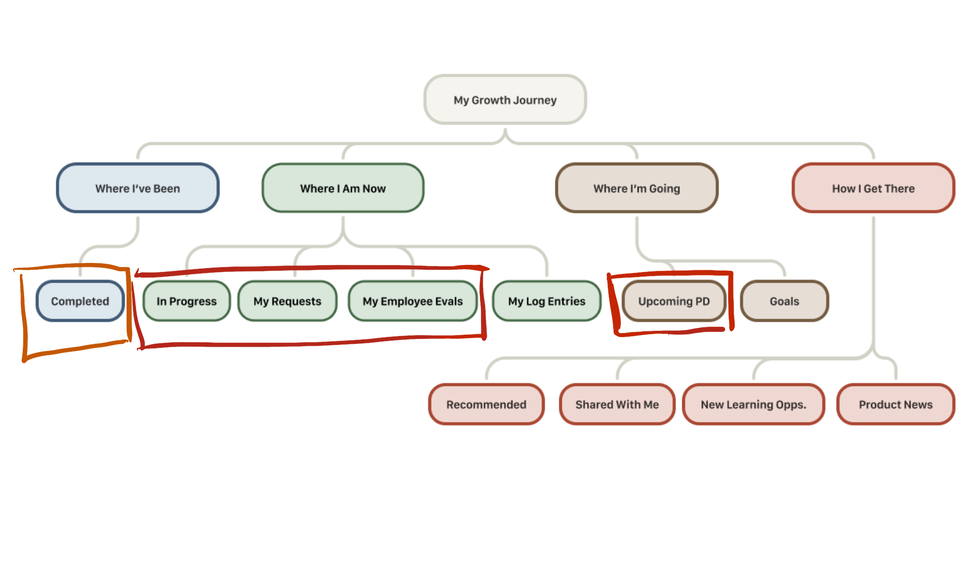
Before diving into design, I mapped the existing architecture and compared it against what participants had told us in interviews: what they came to do, how often, and what they found valuable. The gap was immediate.
The content users prioritized most was scattered across three branches. An entire branch dedicated to content discovery occupied equal navigational weight despite research showing no participant used the dashboard to find new PD. That finding, more than anything else, shaped the restructuring that followed.
Low-fidelity wireframes
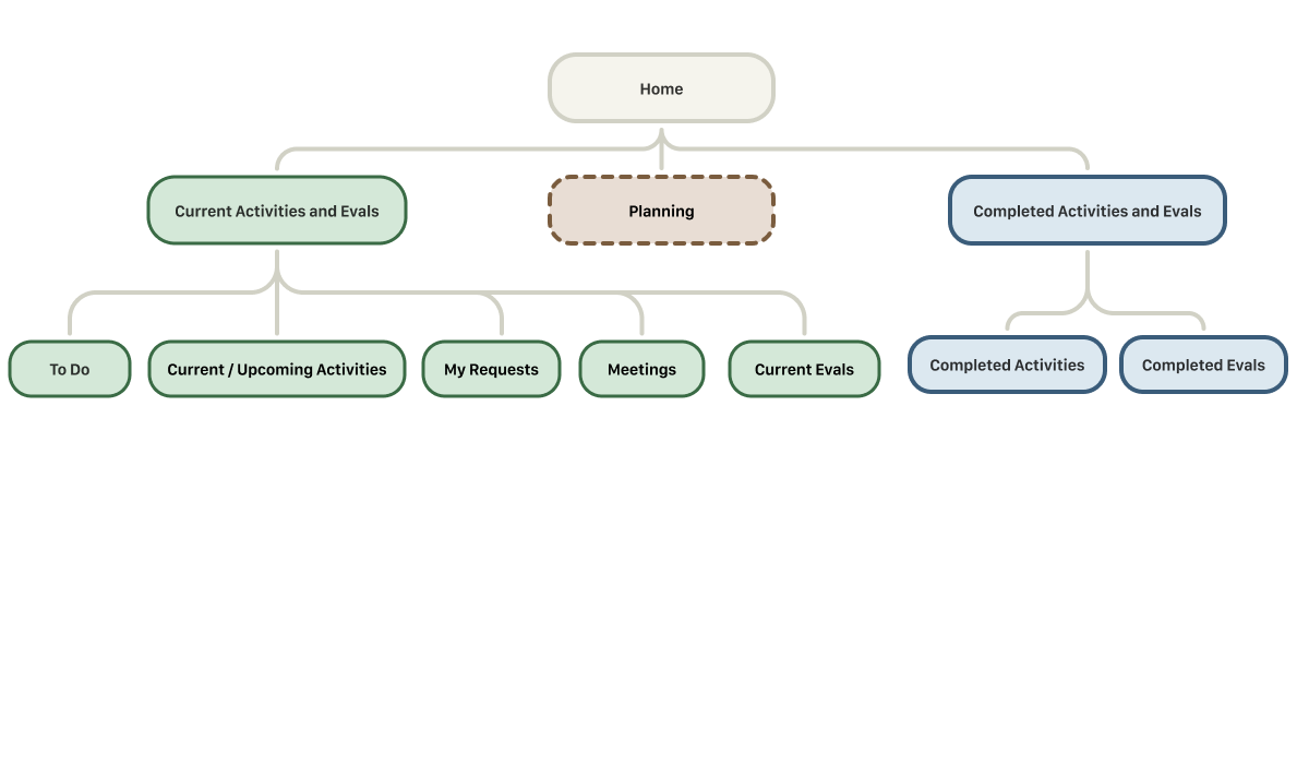
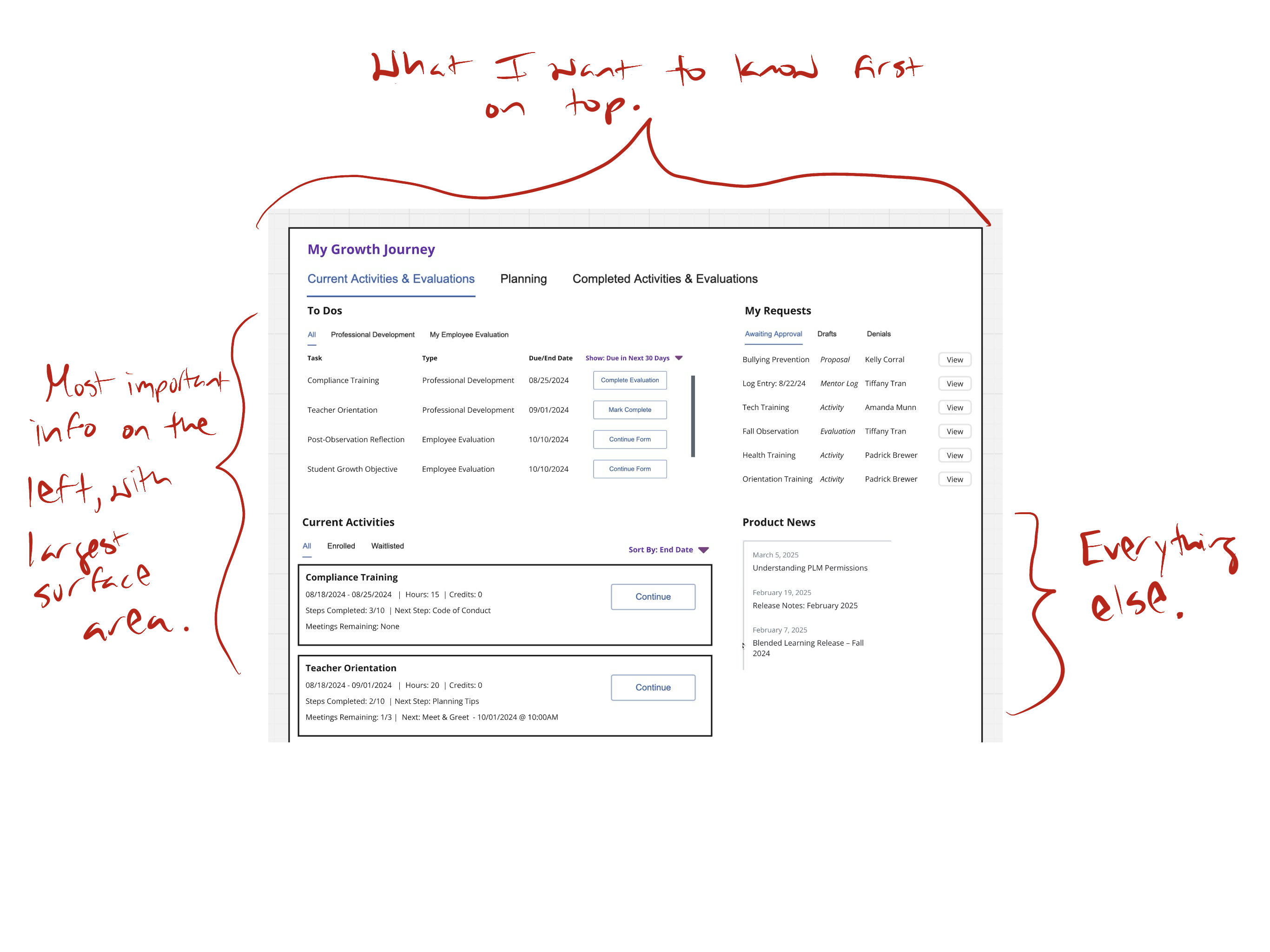
I moved on to low-fidelity wireframes to focus on the new information hierarchy without worrying about interface styling. I restructured the new landing experience around user intent rather than the growth journey metaphor, organizing content by urgency.
Concept validation
I facilitated interviews with six clients across three districts to validate the design direction. Participants immediately understood the to-do panel without explanation and responded to action-specific CTAs as a direct solution to a problem they’d been living with.
“[The current experience] is a little information overload…this [redesign] seems really focused.”
Digital Learning Specialist · Unprompted
“Phenomenal .... [The redesign] would help staff not need to dig too deep.”
District PD Director · Interview Participant
Sessions also surfaced useful refinements: separating upcoming from active items in Current Activities and surfacing activity-related meetings. Both ideas made it to the final designs.
Refining the experience in high fidelity
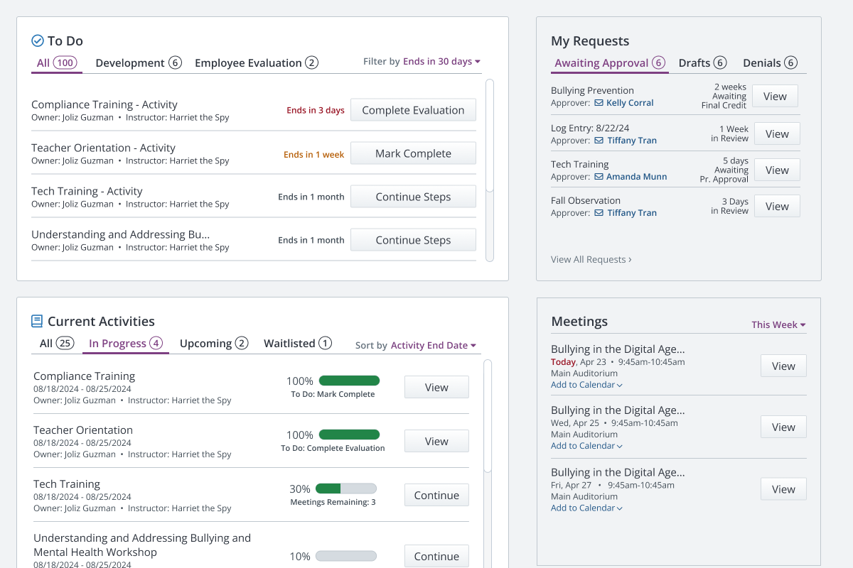
The key design challenge was prioritizing urgent content without hiding secondary information. I proposed a visual treatment using background color to create hierarchy within the tiled layout. Primary tiles — To Do and Current Activities — sat on white card backgrounds. Secondary tiles — My Requests, Meetings, What’s New — used the page’s gray background, appearing “set back” from the primary content.
Design system contribution
I worked with the design system lead to review my proposals. Where existing components already solved the problem, I used them, keeping the system lean. The “set back” tile treatment and several new patterns were approved as reusable React components available to other product teams across the platform.
05 Outcome Unanimous validation, new design system patterns
With unanimous positive responses from participants during concept validation, the team felt confident moving forward with the high-fidelity designs. The final designs were in active development at the time of my departure from Frontline.
New components contributed to the design system were approved as reusable React components, making the patterns available across all of Frontline’s products.
06 Takeaways Reducing branches is a structural argument
- Reducing branches is a structural argument, not just cleanup.Consolidating from four top-level branches to three reflected how users actually think about their work — current, past, and future — rather than the reflective growth narrative the original architecture imposed on them.
- Removing a broken feature is a stronger move than redesigning it.The discovery cluster in “How I Get There” failed because it overpromised on features it wasn’t delivering. Rather than patching it, I created architectural space for a rebuilt discovery experience that could actually deliver on its promise.
- Language changes at the IA level, not just the UI level.Renaming “My Employee Evals” to “Current Evals” removed possessive, role-specific framing in favor of task-state language — the same principle driving call-to-action and status label decisions throughout the redesign.