K–12 EdTechB2C
Zero Tickets on Launch Day
Designing a mandatory account migration that 3,000+ users completed without a single support call about the flow.
The 30-second version
Problem
A mandatory change, mid job search
K12JobSpot users had to move from legacy credentials to a new Frontline account. The migration would interrupt every user while they were looking for work.
What I did
Designed the flow for people who don’t read
Logos and icons carried the message. I tested copy variants with users and designed the success screen to teach the new sign-in.
Outcome
Zero tickets about the flow on launch day
3,000+ users in the first wave. In later waves, fewer than 2% filed migration tickets, a 90% reduction versus the prior approach.
- Role
- Product Designer
- Team
- 1 product designer (me), 1 platform UX designer, 1 K12JobSpot PM, engineering team
- Timeline
- 2 months, K12JobSpot phase
- Scope
- End-to-end flow design, UI design, UX writing, usability testing
Go deeper
01 The problem A forced change, mid job search
K12JobSpot is a consumer job-search platform used by educators nationwide. As part of Frontline’s broader platform modernization, existing users were required to migrate from legacy credentials to a new Frontline account to continue accessing job listings.
The stakes were asymmetric: for the company, this was a technical infrastructure initiative. For users, it was an unexpected interruption at exactly the moment they were trying to find work. Any confusion, any moment where the path forward wasn’t obvious, risked losing them permanently.
02 Context The previous migration attempt had failed
Frontline had tried to unify identity management across its 20+ products once before, in 2016. That initiative failed in part because shadow-migrating users (moving accounts without their active participation) created data integrity problems that took significant customer service resources to untangle.
Research confirmed that approach wasn’t viable here either. The volume of accounts combined with inconsistent user data across products made automated migration too risky. Users would migrate themselves, application by application, as each product came onto the new system.
That decision shaped everything. If users were doing this themselves, mid-login, without any onboarding or preparation, the experience had to be clear enough to complete correctly on their own without calling support.
03 Design approach Designing for the user who isn’t reading
As we all know by now: People Don’t Read
Testing confirmed quickly that people don’t read: people skimmed past explanatory copy, defaulted to autopilot, and filled in credential fields before they’d processed what they were actually doing.
Entry screen: logos over words
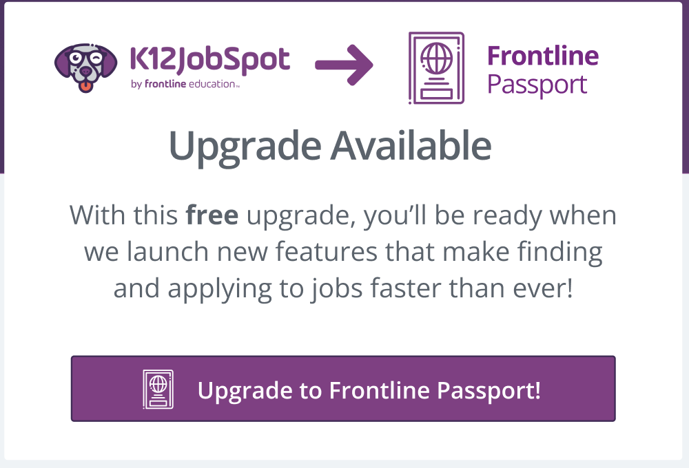
On the entry screen, I proposed using the K12JobSpot and Frontline logos connected by a directional arrow as the primary communication of what was happening. Users who skimmed entirely still understood they were moving from one account to another. This became a pattern reused at key moments throughout the flow.
Credential screen: icons over paragraphs
On the credential-update screen, I replaced paragraph copy with a short icon-led bullet list. Each bullet paired one reassurance with a relevant icon — account continuity, security, data safety. The goal was a screen that worked even when users were operating on autopilot.
Copy strategy: testing language directly
Copy choices mattered more than expected. Through A/B comparisons in moderated usability testing, specific word choices produced measurably different user responses.
Copy variants tested in moderated sessions
I wrote multiple copy variations, tested them directly with users, and brought findings to the product team to advocate for user-preferred language even when it felt less technically precise. Making “free” explicit reduced measurable user anxiety. “Upgrade” tested better than “update” or “convert”. It reframed an imposed change as something happening for users rather than to them.
Post-conversion: designing for what comes after
At that point in the rollout, legacy and new sign-in paths coexisted, and users were likely to revert to old habits the next time they logged in.
I designed the post-conversion success screen to use the exact same CTA that appears on the new Frontline sign-in page. By reusing the familiar button, we were also teaching users where to log in next time.
04 Outcome Zero tickets. Ninety percent fewer calls in subsequent waves.
3,000+
users in the first migration wave
0
support tickets about the migration pathway on launch day
90%
reduction in migration-related support volume vs. prior approach
When the first application migrated, over 3,000 users completed the process with zero support tickets filed about the migration pathway. In subsequent applications, fewer than 2% of users filed migration-related tickets. Compared to Frontline’s previous shadow migration approach, that’s a 90% reduction in estimated support volume.
The pattern established for K12JobSpot (logo-led entry, icon-anchored reassurance, tested copy, success screen that teaches the next behavior) became the foundation for subsequent migrations across the platform.